Responsive(ish) Layout
Responsive(ish) Layout!
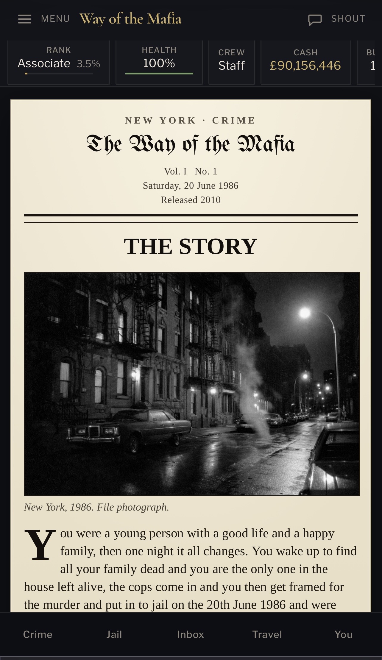
One of the bigger jobs in rebuilding Way of the Mafia has been getting the game to behave properly on mobile.
The original script was built long before responsive layouts were something anyone really worried about. It relied heavily on frames, fixed-width sections and a desktop-first layout, so trying to make that work on a modern phone was never going to be a case of adding one media query and calling it a day.
Where it is now
The mobile version is finally starting to feel like its own proper layout rather than the desktop game being crushed into a smaller screen.
The main navigation has been simplified into a mobile menu, the shoutbox has its own shortcut, and the most commonly used areas of the game now sit in a fixed navigation bar at the bottom of the screen.
The stat bar is also still there at the top, showing things like rank, health, crew and cash without taking over the entire display.
It isn't perfect yet, hence the "(ish)" in the title. Some areas still need tidying up and there are plenty of pages that were never designed with a phone screen in mind.
The story page
The Story page has probably been one of my favourite parts to work on so far.
Rather than just putting the original story text into another dark panel, I've given it more of an old newspaper feel. The game itself keeps the darker modern interface around it, while the actual story sits on a lighter newspaper-style page with period imagery.
It gives the story its own identity without changing the rest of the game.
The screenshot above is how it currently looks on mobile.
Still to do
There is still quite a bit left to improve:
I'm deliberately trying not to completely redesign everything into a modern app.
I still want Way of the Mafia to feel like an old-school browser game. The goal is simply to make that style comfortable to use on the devices people actually have now.
Responsive? Mostly. Finished? Definitely not yet.
One of the bigger jobs in rebuilding Way of the Mafia has been getting the game to behave properly on mobile.
The original script was built long before responsive layouts were something anyone really worried about. It relied heavily on frames, fixed-width sections and a desktop-first layout, so trying to make that work on a modern phone was never going to be a case of adding one media query and calling it a day.
Where it is now
The mobile version is finally starting to feel like its own proper layout rather than the desktop game being crushed into a smaller screen.
The main navigation has been simplified into a mobile menu, the shoutbox has its own shortcut, and the most commonly used areas of the game now sit in a fixed navigation bar at the bottom of the screen.
The stat bar is also still there at the top, showing things like rank, health, crew and cash without taking over the entire display.
It isn't perfect yet, hence the "(ish)" in the title. Some areas still need tidying up and there are plenty of pages that were never designed with a phone screen in mind.
The story page
The Story page has probably been one of my favourite parts to work on so far.
Rather than just putting the original story text into another dark panel, I've given it more of an old newspaper feel. The game itself keeps the darker modern interface around it, while the actual story sits on a lighter newspaper-style page with period imagery.
It gives the story its own identity without changing the rest of the game.
The screenshot above is how it currently looks on mobile.
Still to do
There is still quite a bit left to improve:
- Tidy up pages that still feel too wide on smaller screens
- Improve how some stats behave when there isn't enough horizontal space
- Make older forms and tables easier to use on touchscreens
- Go through the remaining game pages individually
- Keep testing navigation and menus at different screen sizes
I'm deliberately trying not to completely redesign everything into a modern app.
I still want Way of the Mafia to feel like an old-school browser game. The goal is simply to make that style comfortable to use on the devices people actually have now.
Responsive? Mostly. Finished? Definitely not yet.